
FarmRoots beginner farmer education curriculum :: Visual Toolkit
Step 1 :: The process started off with an introduction to the current curriculum content and the general goals of the new visual piece we would be creating. After doing a thorough content inventory we came up with an idea of a "Toolkit" that the student would use in addition to the current worksheets and handouts to establish the goals of the course and keep them fresh in the students mind while making their way through an intensive and content heavy class.
Our idea was to divide the class up into sections that were naturally defined by the current content, establish the key goals for each section and then create the visuals for each section that would fill out a booklet small enough to carry around and fit into their main binder, but large and substantial enough to feel authentic, get the point across and have extra room to jot down notes and personal thoughts.

content and strategy development presentation
Step 2 :: We knew we needed to get a jump on the look and feel of the piece so we could start coming up with wireframe presentations that would lay out our complete idea and we wanted to work simultaneously on that. I took some time to come up with three distinctive color palettes and mood boards with inspiration for what I could envision for this piece. The clients were self-proclaimed newbies to the creative process so I pulled out description words and phrases to help them visualize why I chose these directions as potentials for the toolkit. They decided to go for direction 1, which was my personal favorite as well. They were drawn to the inviting color palette and the level of detail in the icons and illustrations. The reason I chose to go with 9 colors in the palettes is I knew from the previous strategy session we would divide the toolkit into sections and I envisioned basing each section on one color for ease of use.

color palette & mood board "look and feel" presentation
Step 3 :: The next step was to sketch, sketch, sketch. Here is where I started to come up with the metadata guide and "badges to symbolize goals" development. I also started sketching concept development for spreads to show how the goals (we defined in step 1) would be visualized. Next to the sketches you'll see the final icon designs.

sketches for icon and metadata system development

final designed icons and badges
Step 4 :: Next up was to wireframe out the complete booklet so we could see how many pages the final booklet would be, and which pages would be dedicated to the individual sections. After an initial sketch I came up with two full wireframes; one to focus on the section breakdown and content for each spread, and one to focus on how the metadata badge system would be carried through the whole booklet and how color would play an important part in this.

layout and strategy development wireframes
After these were approved it was a lot of sketching, editorial development and layout & design to get to the finished product!
NSLIJ Transforming Healthcare :: Sales Brochure
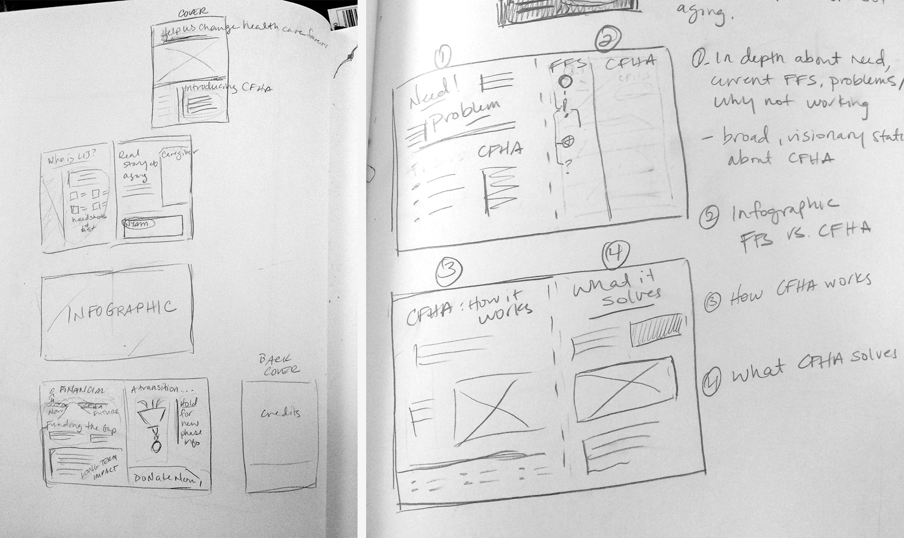
layout mockup sketches


